

How to choose colours for your kitchen (and home)
15th September 2026
Colour, it’s a big old head-scratcher isn’t it? We thought it might be helpful to put together some of our tips and thoughts and ideas on how to tackle the most exciting (and often most stressful) decision in our kitchens, and homes…
There is an air of mystery surrounding colour in interior design. A sense that there’s a formula you need to know before making sweeping statements and recommendations. We think people worry more about colours than anything else.
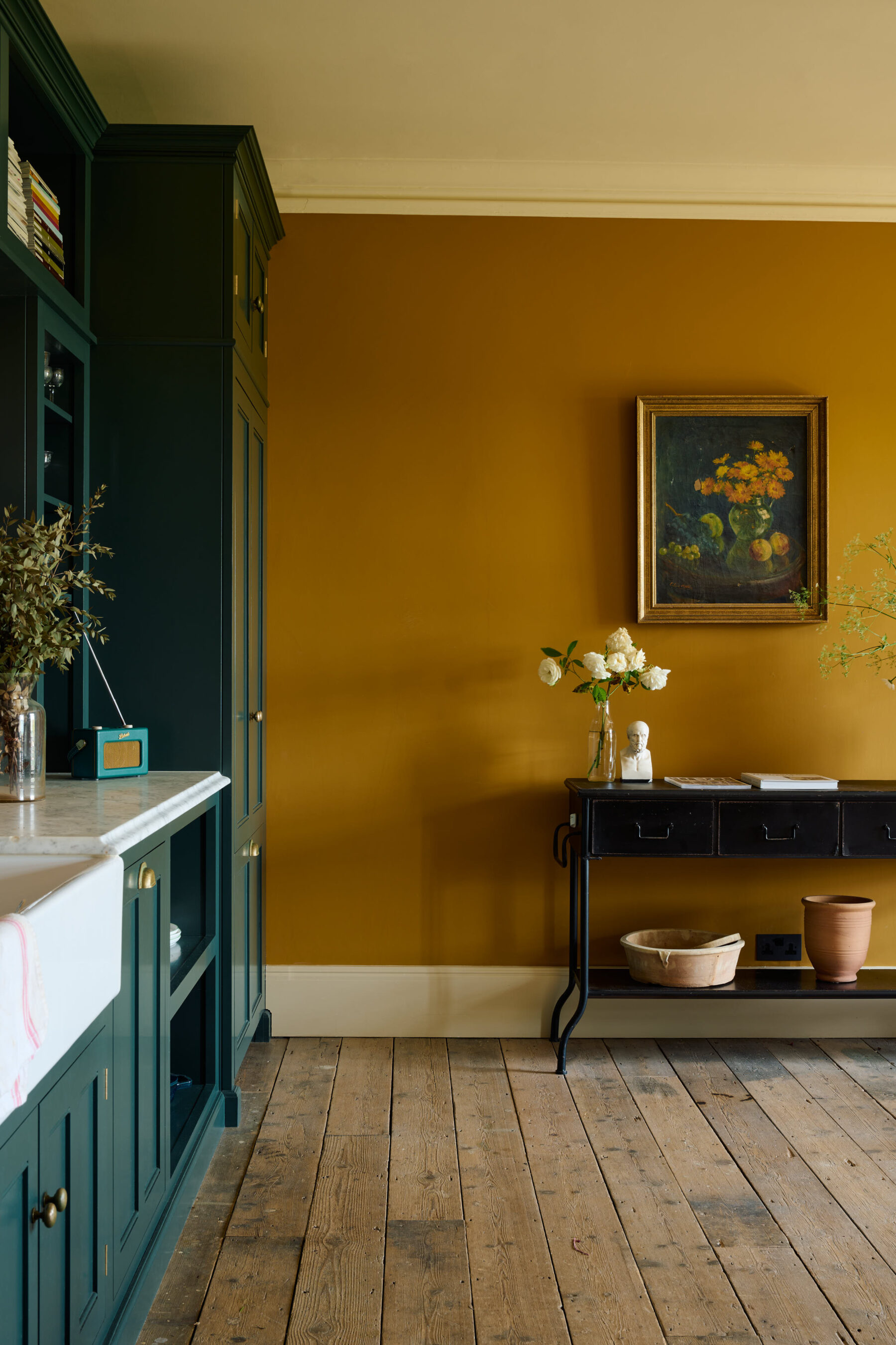
The question we get asked more than any other is which colour someone should paint their kitchen, but when we give a clear answer, it often gets a mixed response. Colour is such a personal thing. One approach you can’t really go wrong with is to bring the colour in with your accessories and just stick to a classic look for your walls and cupboards.
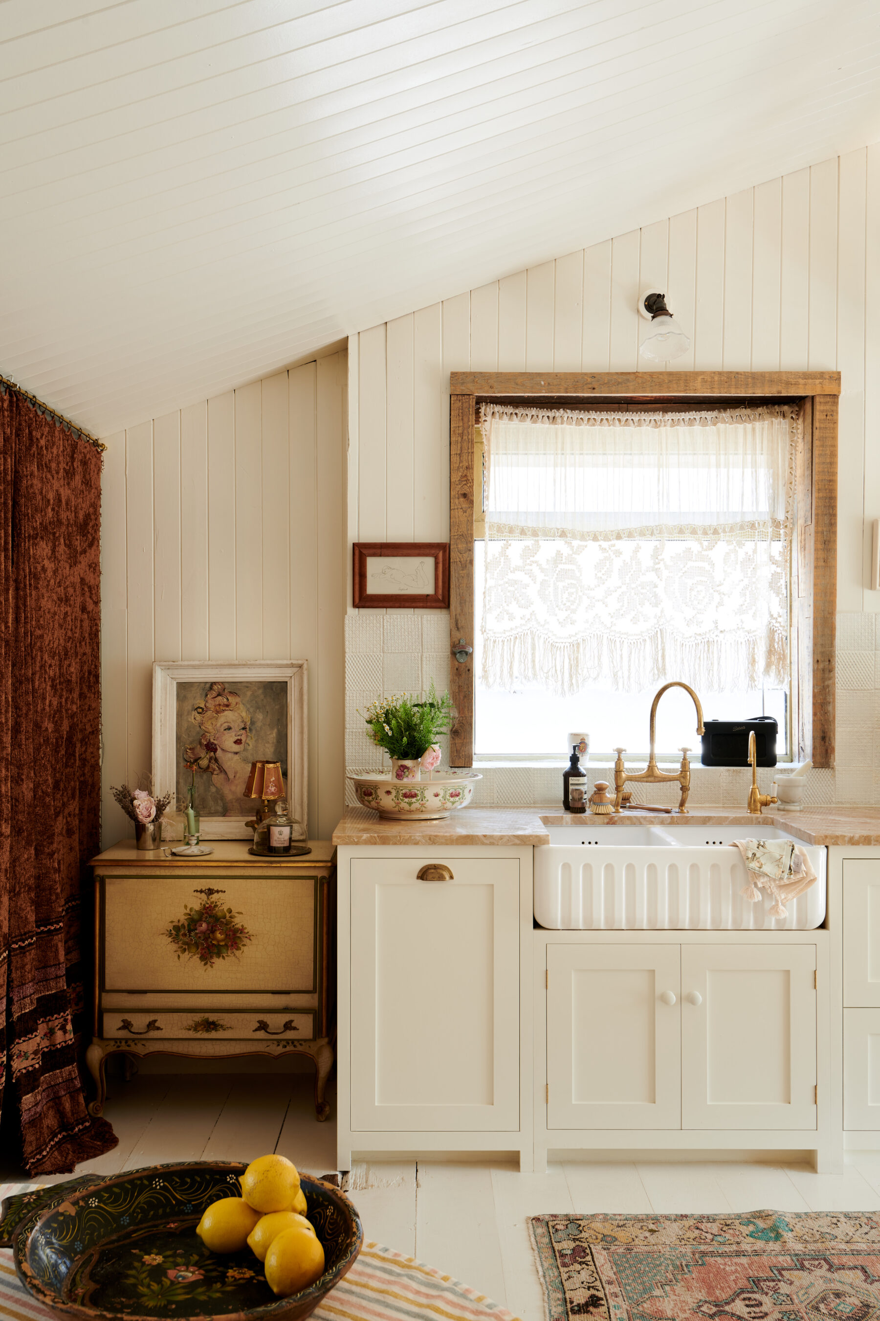
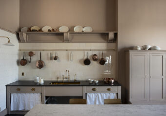
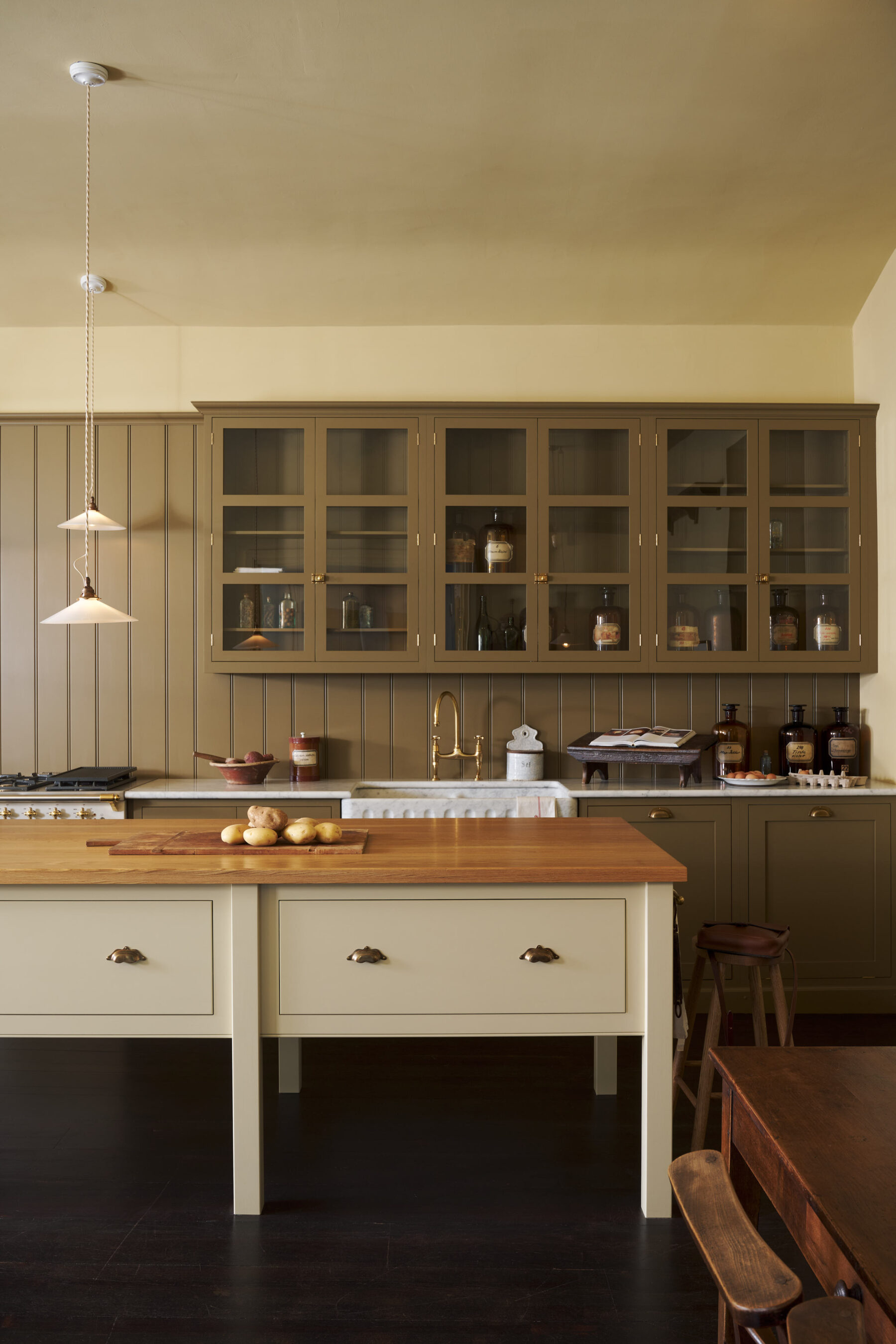
Black is a good choice for furniture, very traditional and solid. Mellow yellow is another favourite of ours, perfect in a dark or shady home as it really does exude warmth. Rich but pale creams mixed with earthy browns and greens is another timeless combination.
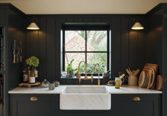
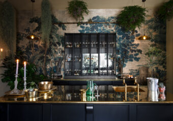
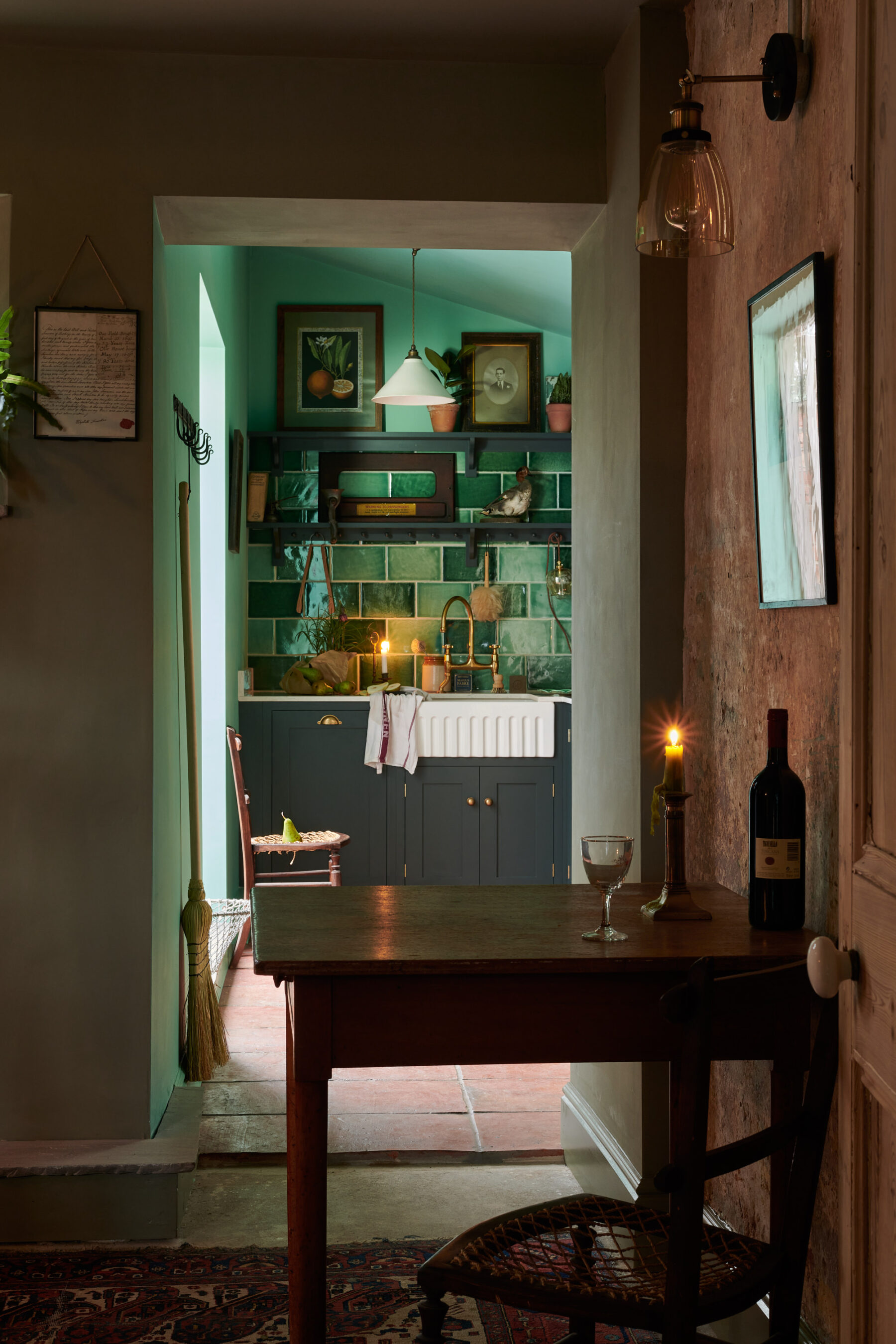
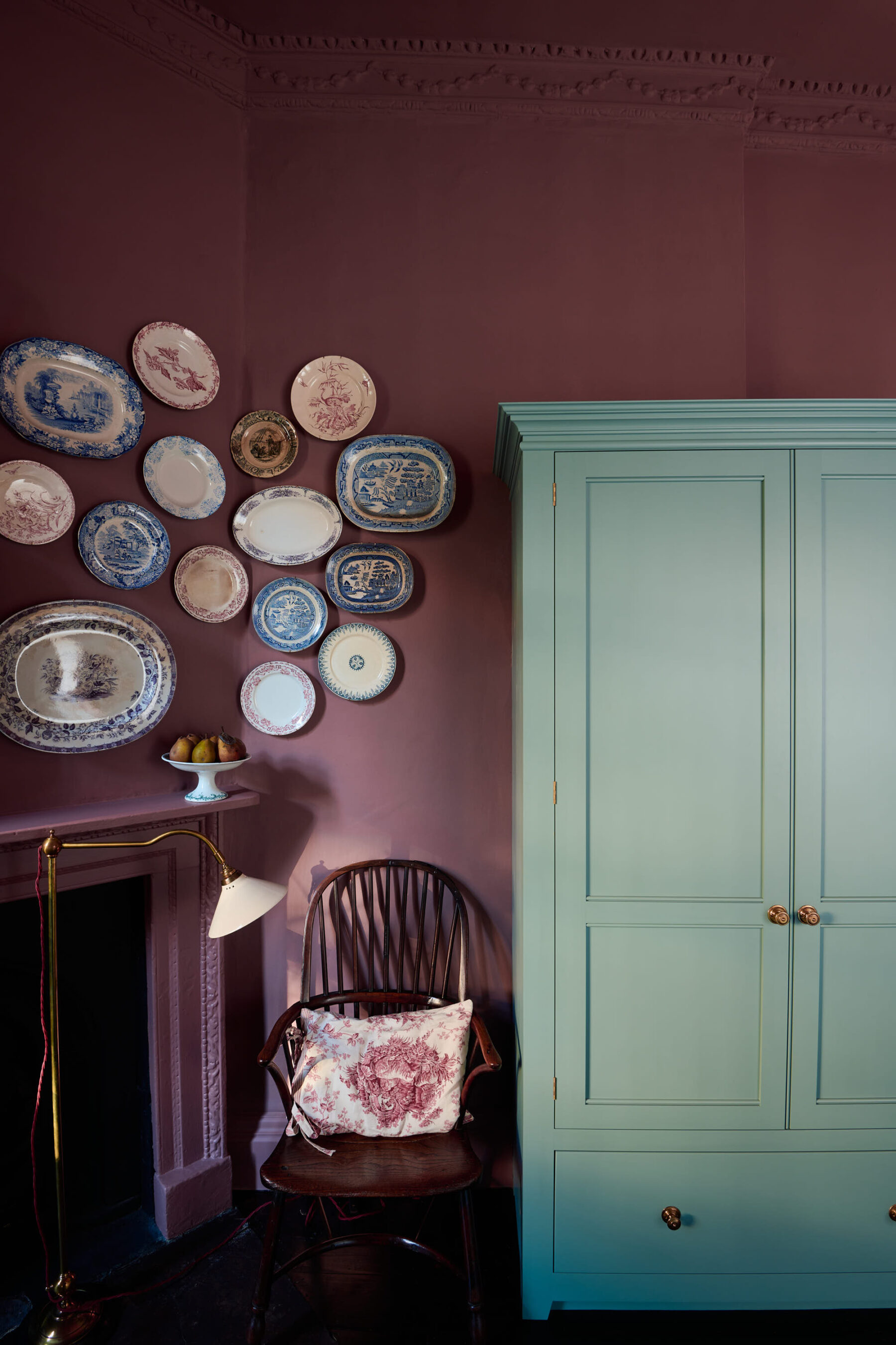
Or go totally dark and moody. Big or small, this works. Never let space restrict your choices. Colour is a decision that should be primarily based around the atmosphere you want to create, rather than trying to make a small room look big. However small a room is, if you want moody and atmospheric then go dark or bold or busy, if you want it to look clean and minimal then go for light, pale colours.
But whatever colour you choose, it’s a personal thing, just make sure it’s one you love. All you really need to remember is to have some cohesion between your kitchen and adjoining rooms. Your new kitchen needs to flow with the rest of your home. Not matchy-matchy, but we want it to feel easy on the eye. Taking the floor or wall colour from room to room helps with this.
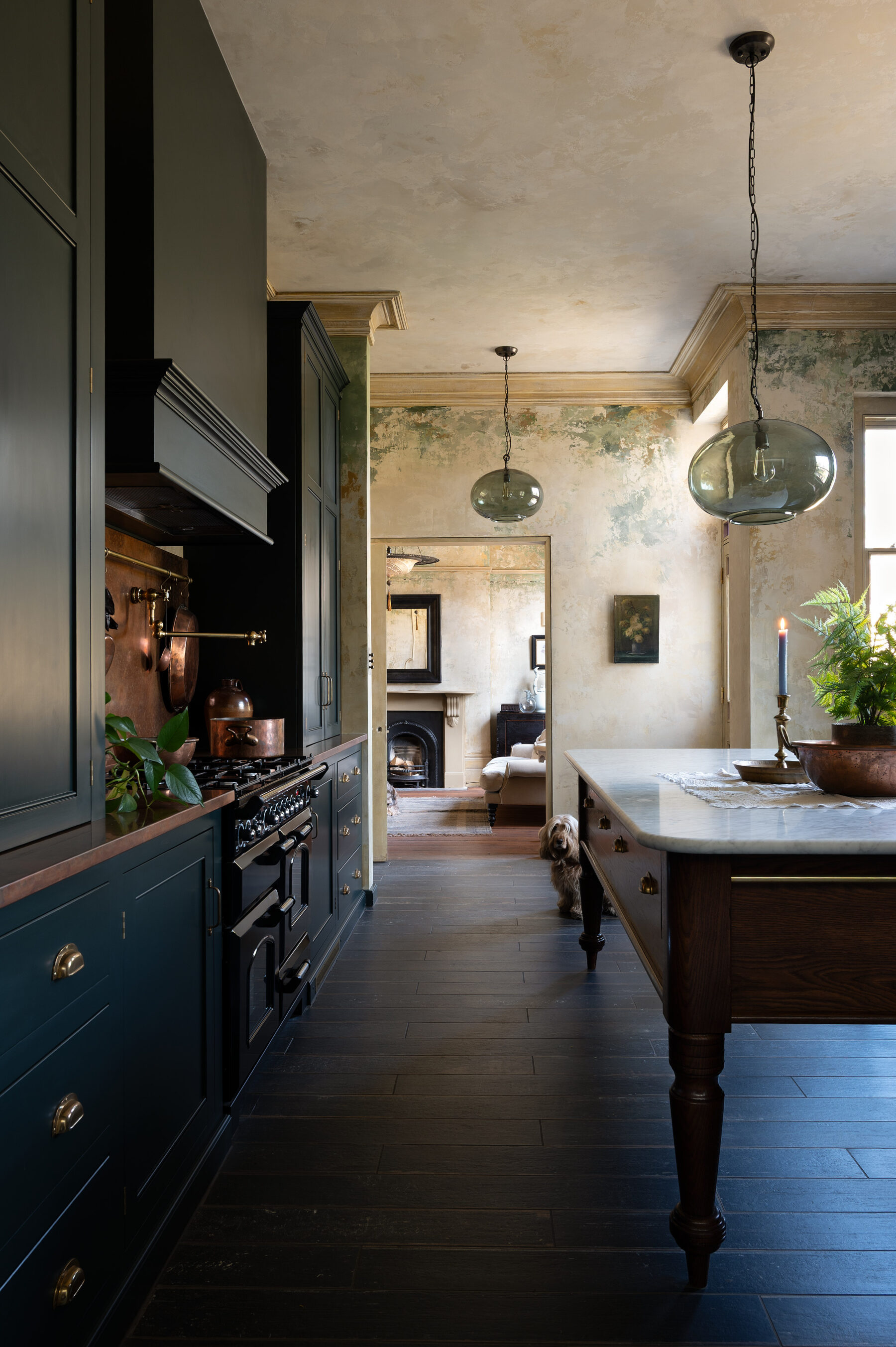
There should be a common theme running through your rooms. This creates a look, your look. It becomes a trademark, so your home feels consistent, rather than like a collection of different rooms that you have experimented in. A theme does not necessarily mean a specific look – say industrial or mid-century – but it can, and that certainly can work if done really well. Using similar textiles, colours, tones and styles throughout your rooms is actually easier than you might think, mostly because people tend to have a certain taste that follows them around their home.
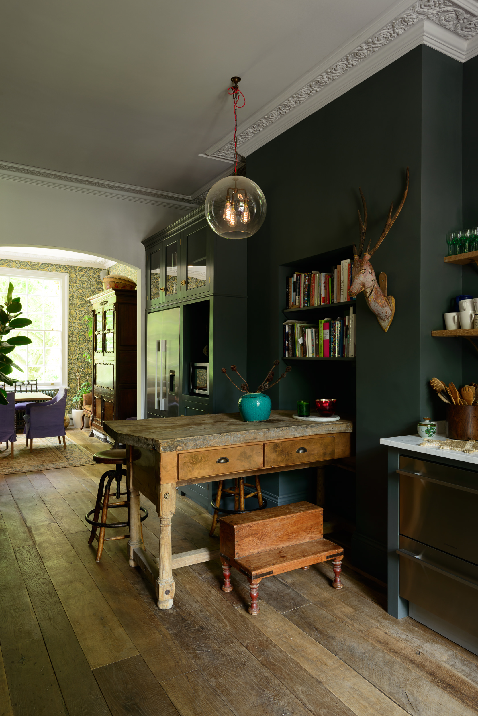
But for some reason the kitchen often used to get different treatment! It was this beacon of bright lights and super sleek surfaces, but thankfully that is not the case anymore. We have learned over the last decade that kitchens are an extension of our other comfortable rooms, so we have begun to decorate them just like we decorate our living spaces, with fabrics, wallpapers, soft lamps and candles.
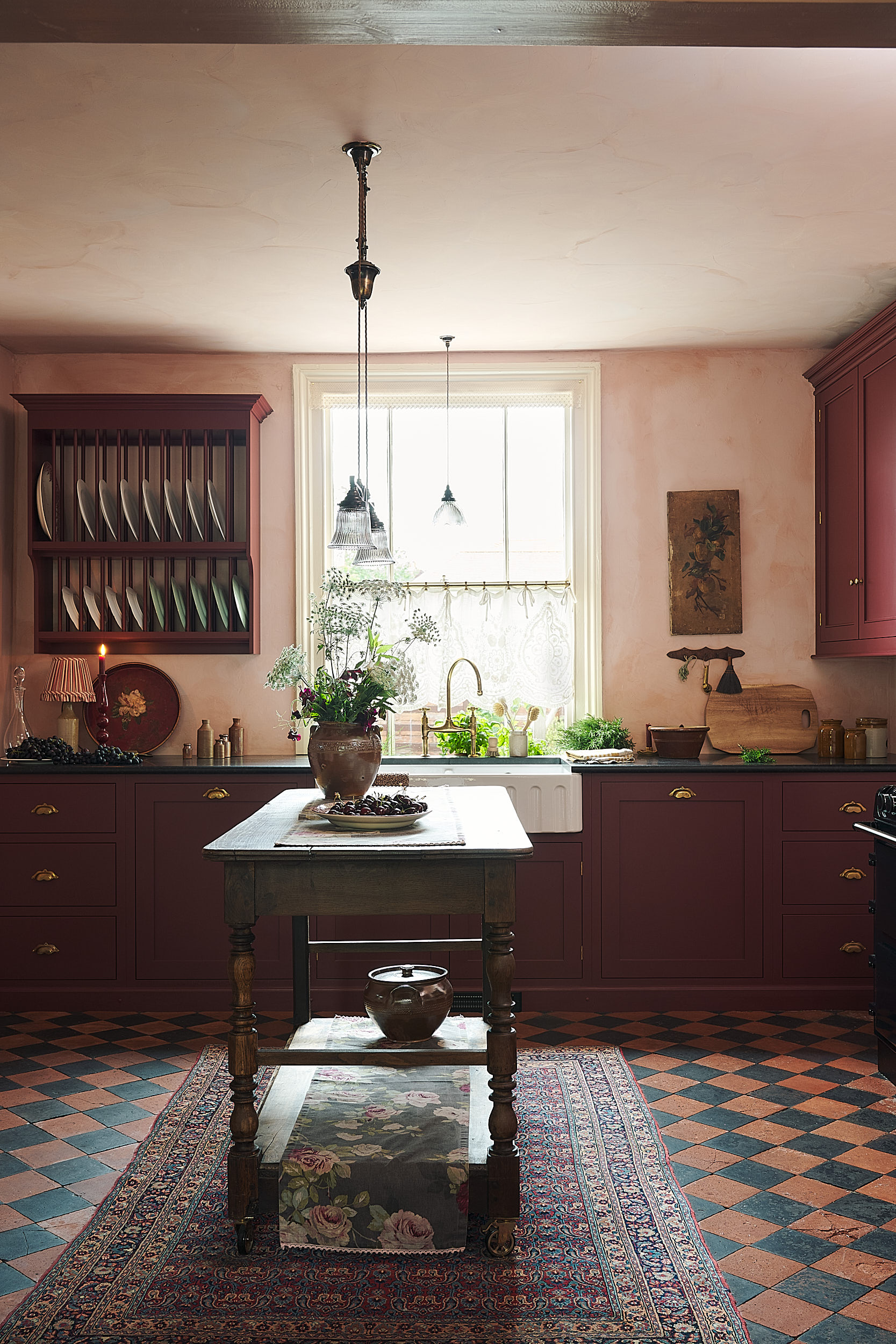
We find it helps to look at your belongings when choosing colours. Maybe look at a piece of art, some crockery or a fabric that you will have in the kitchen and use it as a guide. For example, Helen’s kitchen began with a painting, she knew this artwork would be important in the room and she wanted it to fit in perfectly because she loved it. Helen picked tiles, wall colours and furniture colours loosely based around this painting. It stopped her having too much choice and gave her a good, limited colour palette…
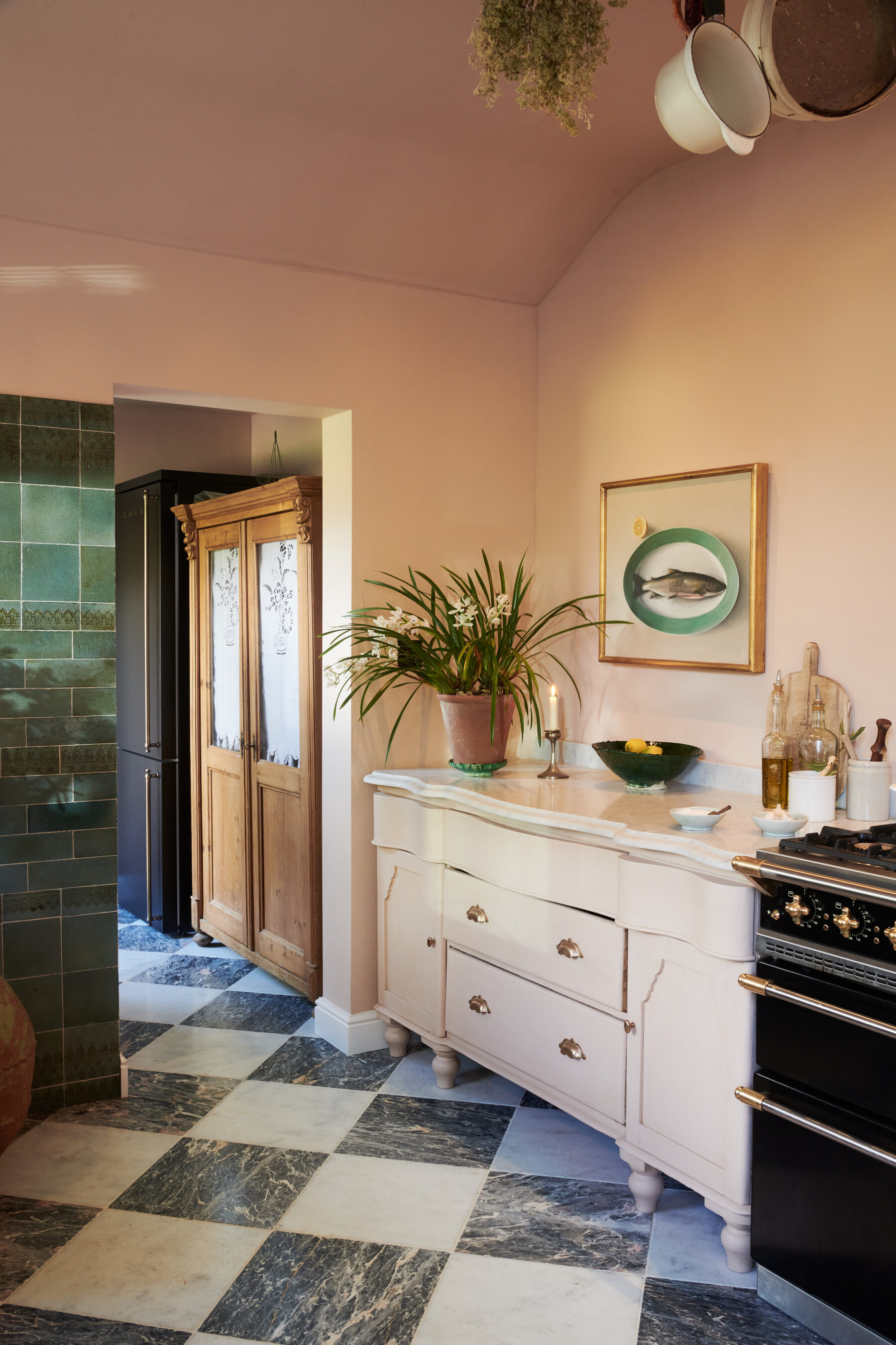
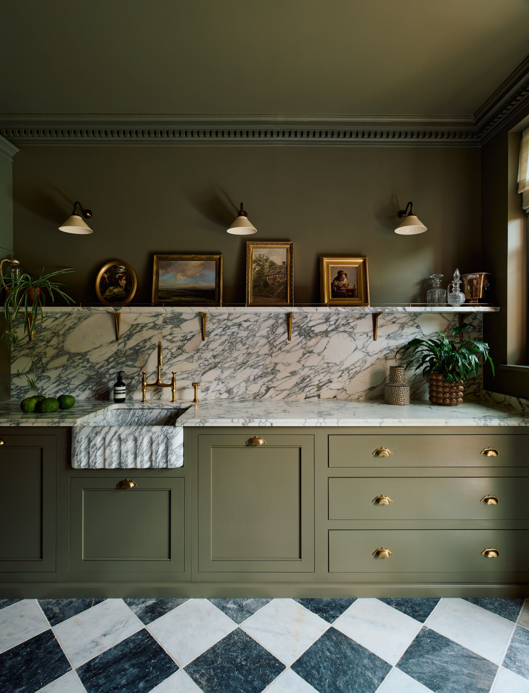
We find that textures are as important as paint colours. Natural products like marble and wood are easy, as they just settle in, but they are still colours and need to be considered as carefully as the walls. Try to use similar woods on floors, worktops and vintage cupboards if you can, just to keep the colour palette from getting too broad.
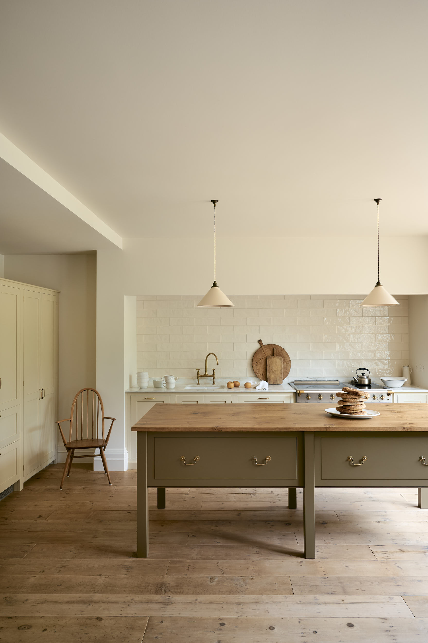
Don’t paint walls in different colours. Accent walls are bad news! We like to do the ceiling and woodwork all in the same shade. Especially good if you have a room full of angles, pipes and awkward bits and you don’t want these spots to stand out, if everything gets the same colour, the imperfections just seem to fade away.
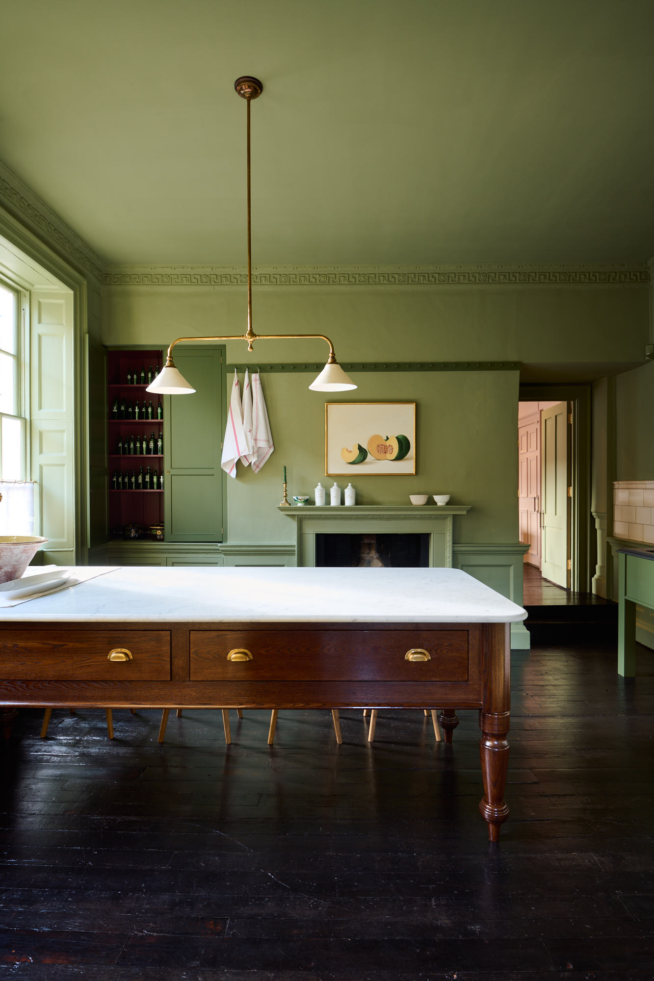
So, having a starting point is key, a point of reference to work from that stops you getting overwhelmed and confused by choice. And don’t forget there are no rules when it comes to colour. Be bold, be brave, have fun!
– You can purchase deVOL paint if you’re in the UK, here.
– Need more colour (and colour combination) inspiration? Have a look at our project pages.
– Take a look at how our Design Service works, we’d love to talk about your upcoming project.
– Keep up to date with all things deVOL on our Instagram.