The Shaker Paint Collection by deVOL
25th May 2021
A little look at deVOL’s beautiful Shaker Paint Collection and hopefully a handy little blog for any of our customers who are a bit stuck on which shade to choose. This mix of colours have been very carefully chosen and have the ability and ease to suit everyone. We have cool colours to fit modern and Scandi style homes, we have classic colours for period properties and those with a more traditional style and we have the dark, slightly more industrial colours. These shades work beautifully alone or can be used in groups of two or even three for a more eclectic look. We know how daunting picking colours can be, but with a little consideration and a little bit of impulse you can really make an impact…
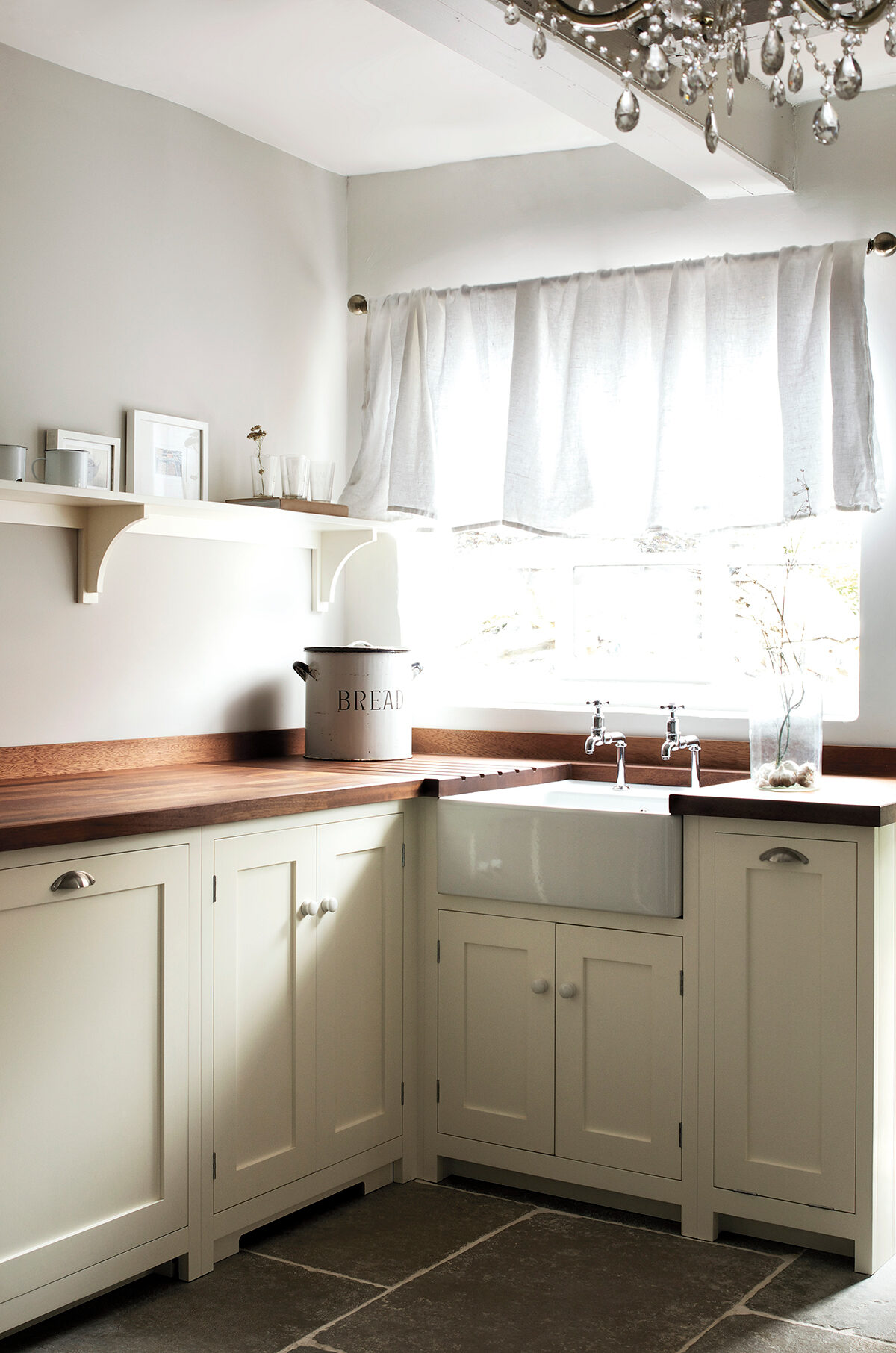
L I N E N
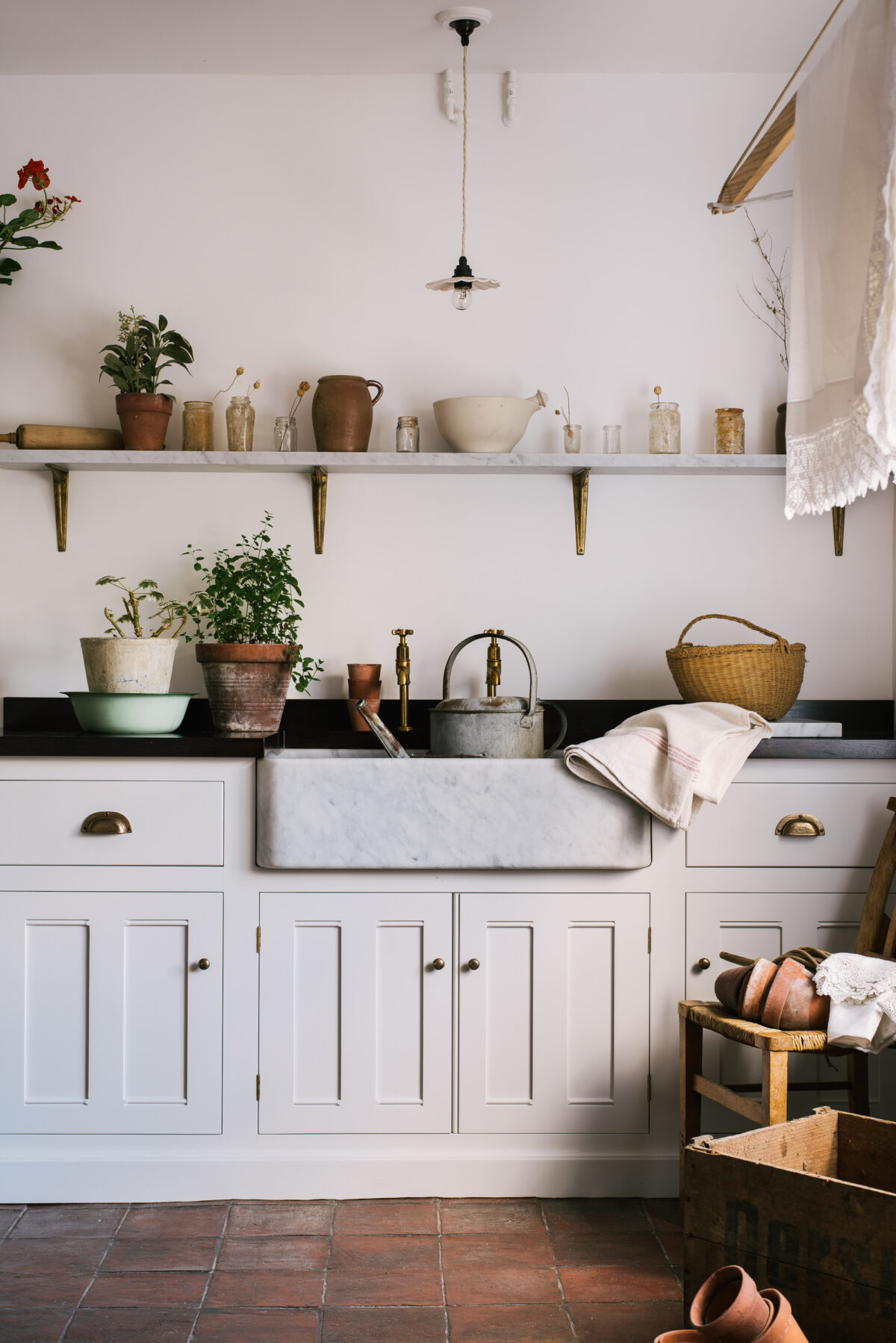
A classic creamy cream, but not yellowy, this is the perfect colour for a natural and light filled kitchen. It is the easiest of colours to work with and goes perfectly with light and dark worktops, brass or silver fittings and traditional or contemporary settings. A firm favourite with everyone and sometimes there is nothing more beautiful than keeping it simple. One of my favourite examples of Linen is in our Wymeswold Kitchen project, another great one to see this colour in all its glory is the Clerkenwell Kitchen.
D A M A S K
Cool, slightly greyish tones and great as a combination colour, mix it with Refectory Red or Printer’s Black for a strong, clean and very smart look. This colour looks beautiful with wood and brass fittings and is completely timeless. The Millhouse Scullery and Millhouse Kitchen are both painted totally in Damask, and to see this subtle shade mixed with contrasting Pantry Blue, check out the Coach House Kitchen.
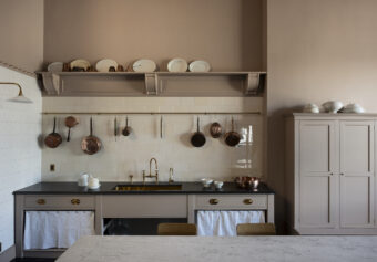
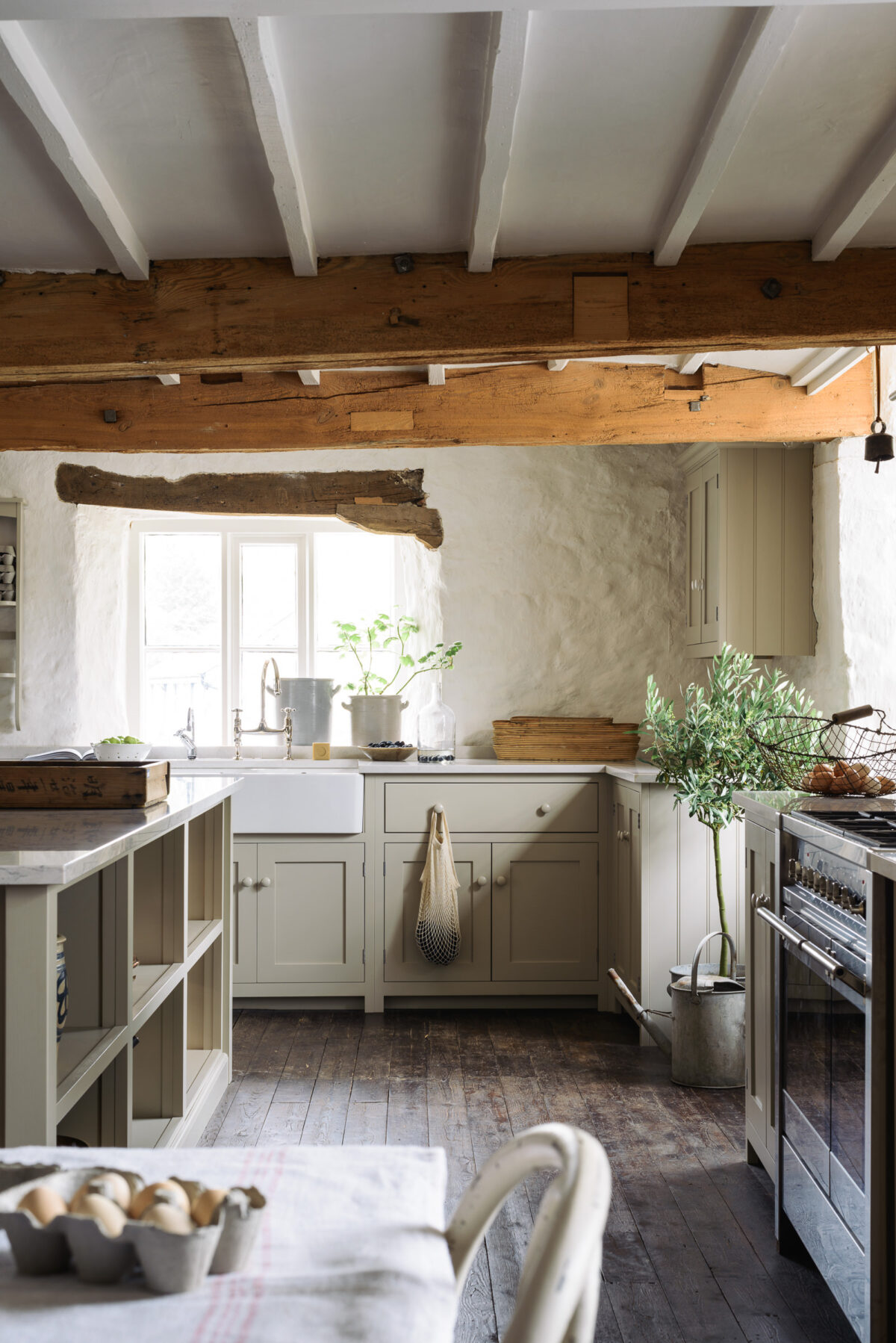
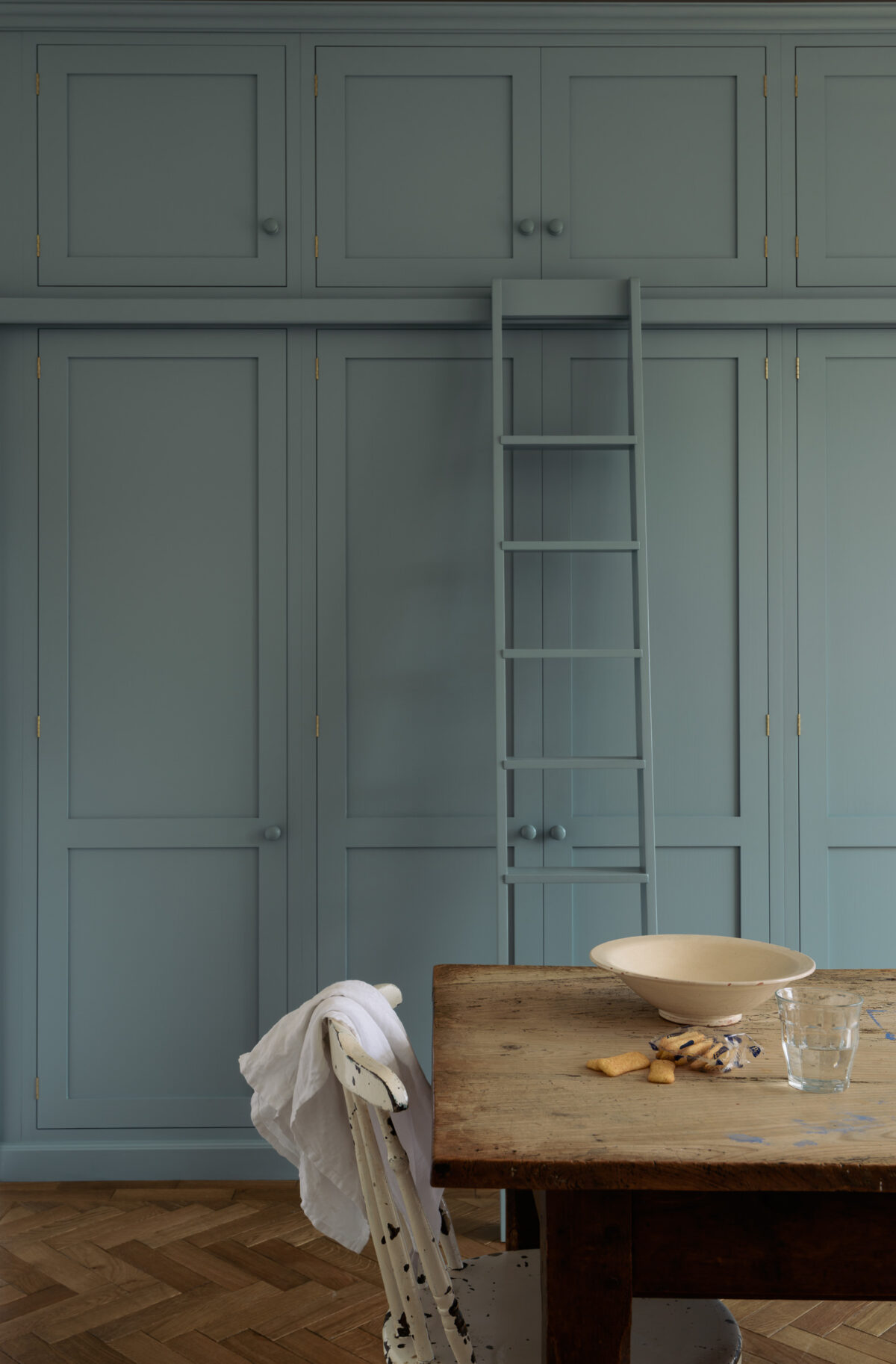
M U S H R O O M
One of our favourite colours for a kitchen, it seems to work wherever it goes, soft and warm yet light enough for even the darkest of corners. The classic combination of marble and Mushroom paint is always perfect. It’s almost a deVOL look in itself and has graced literally hundreds of our most coveted rooms. Take a little look around the Cotes Mill Shaker display, the Kew Kitchen and the Countryside Kitchen Outside Berlin for some beautiful examples of Mushroom.
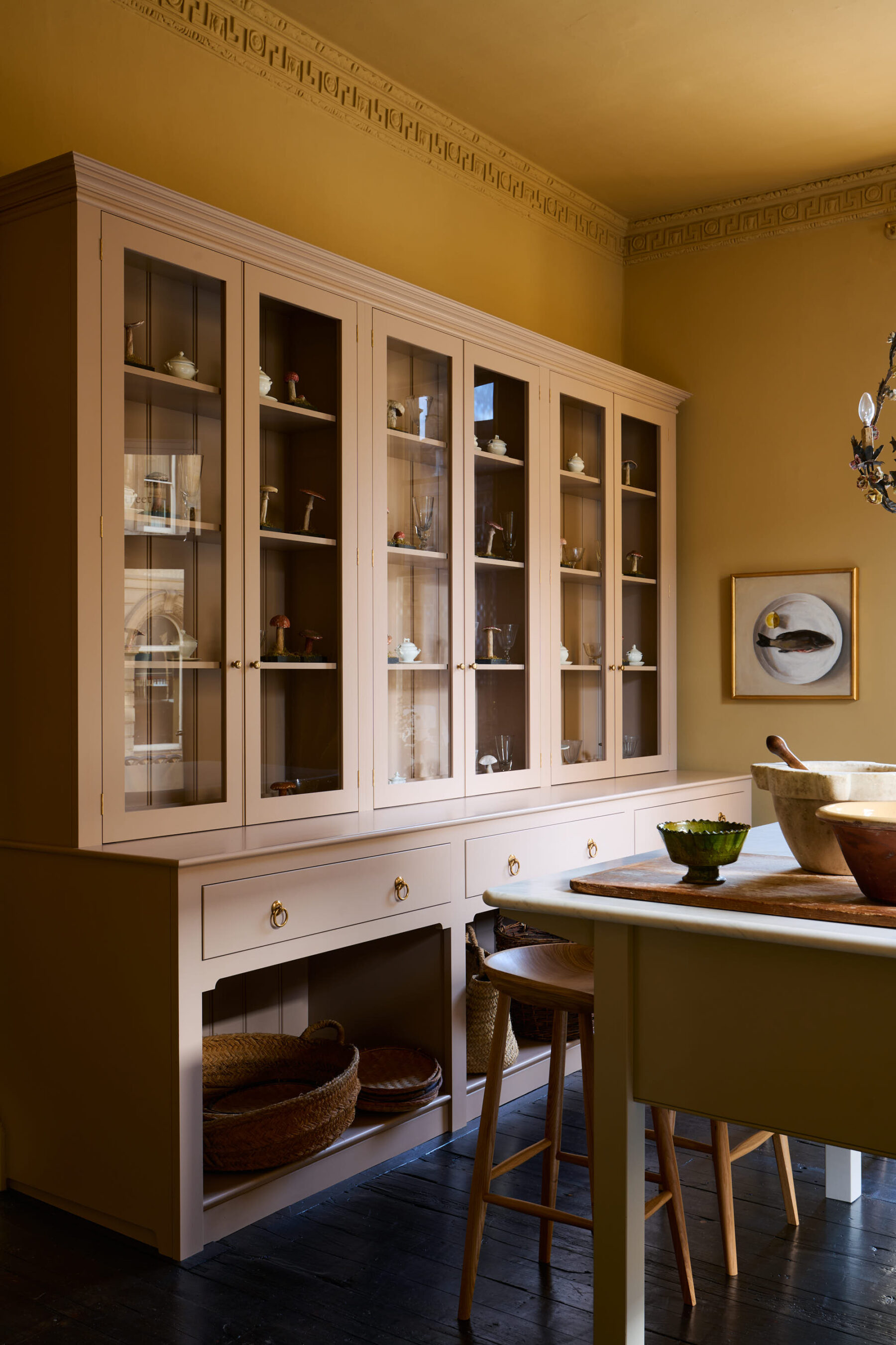
P R I N C E L E T P I N K
Our new favourite shade. A pale blush pink that softens the look of everything it touches. Far from harsh, more a suggestion of colour. Take a look at Princelet Pink on our very handsome Butler’s Pantry and on this huge Classic English dresser and prep table in the Yellow Room in Bath…
(This shade is exclusive to our kitchen customers and not available to purchase separately)
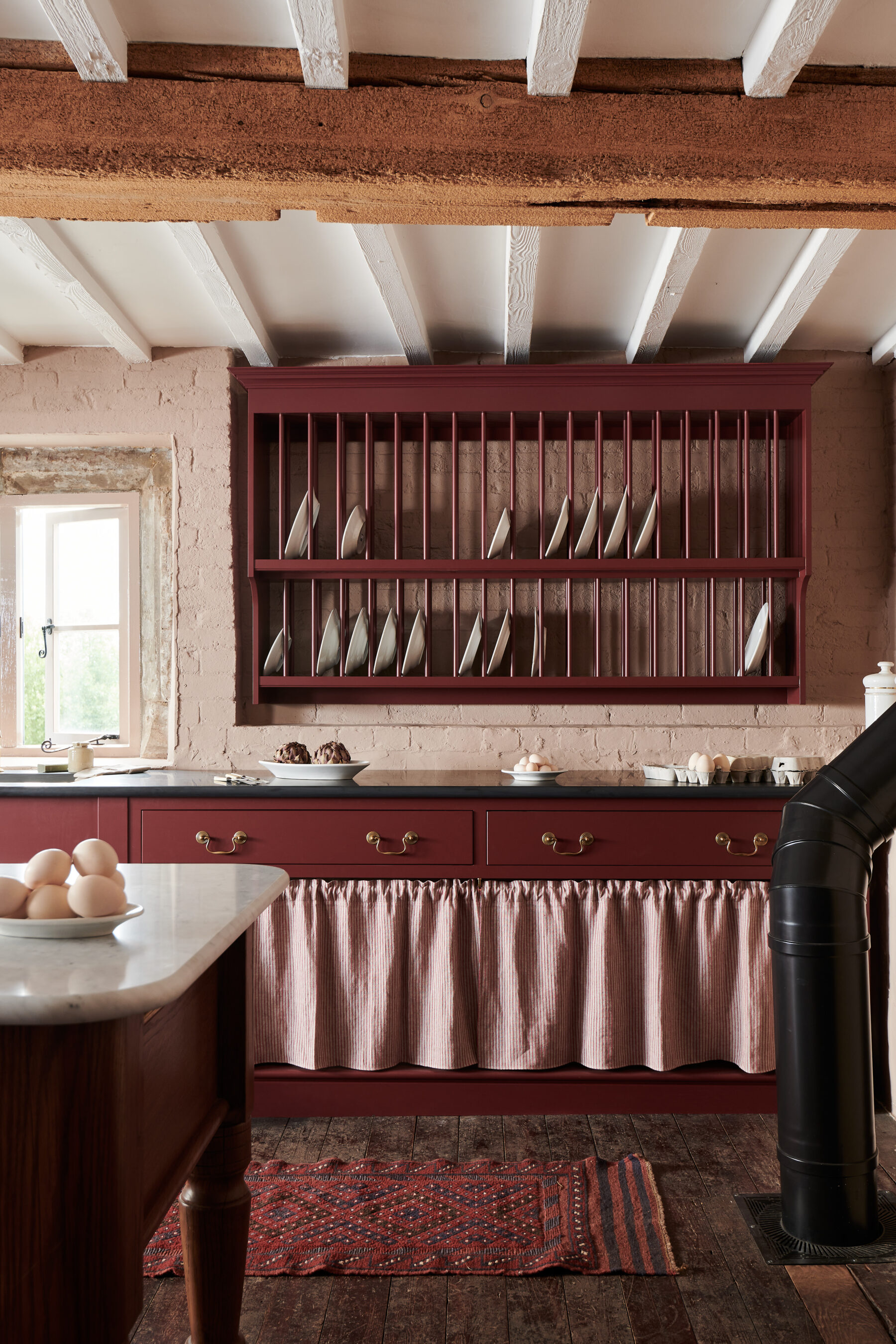
R E F E C T O R Y R E D
A very traditional colour that was often used in country house kitchens, this rich deep red works anywhere and has the ability to make a piece of furniture instantly feel grand and smart. Mix with black granite or slate for a truly authentic look. It looks so good used to the max in this South London extension and cosy Oxfordshire Farmstead, paired with warm yellow walls in our Bond Street showroom and perhaps our favourite place, the Heirloom kitchen at Cotes Mill…
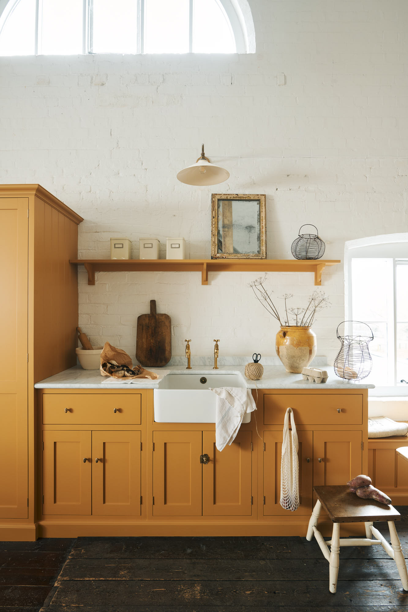
S C U L L E R Y Y E L L O W
The Shakers would use yellow to brighten up a dark corner of the room and bring a feeling of sunlight to a space. This mustard yellow is wonderful for transforming a space with its warm, cheerful and uplifting tones. Mix with wooden worktops and brass fittings for a gentle, easy and very Shaker look. Every time we see this yellow, we love it a bit more, we think it’s the fact that it’s not bright but very mellow and alluring, how perfect does it look in our little St Ives seaside cottage?
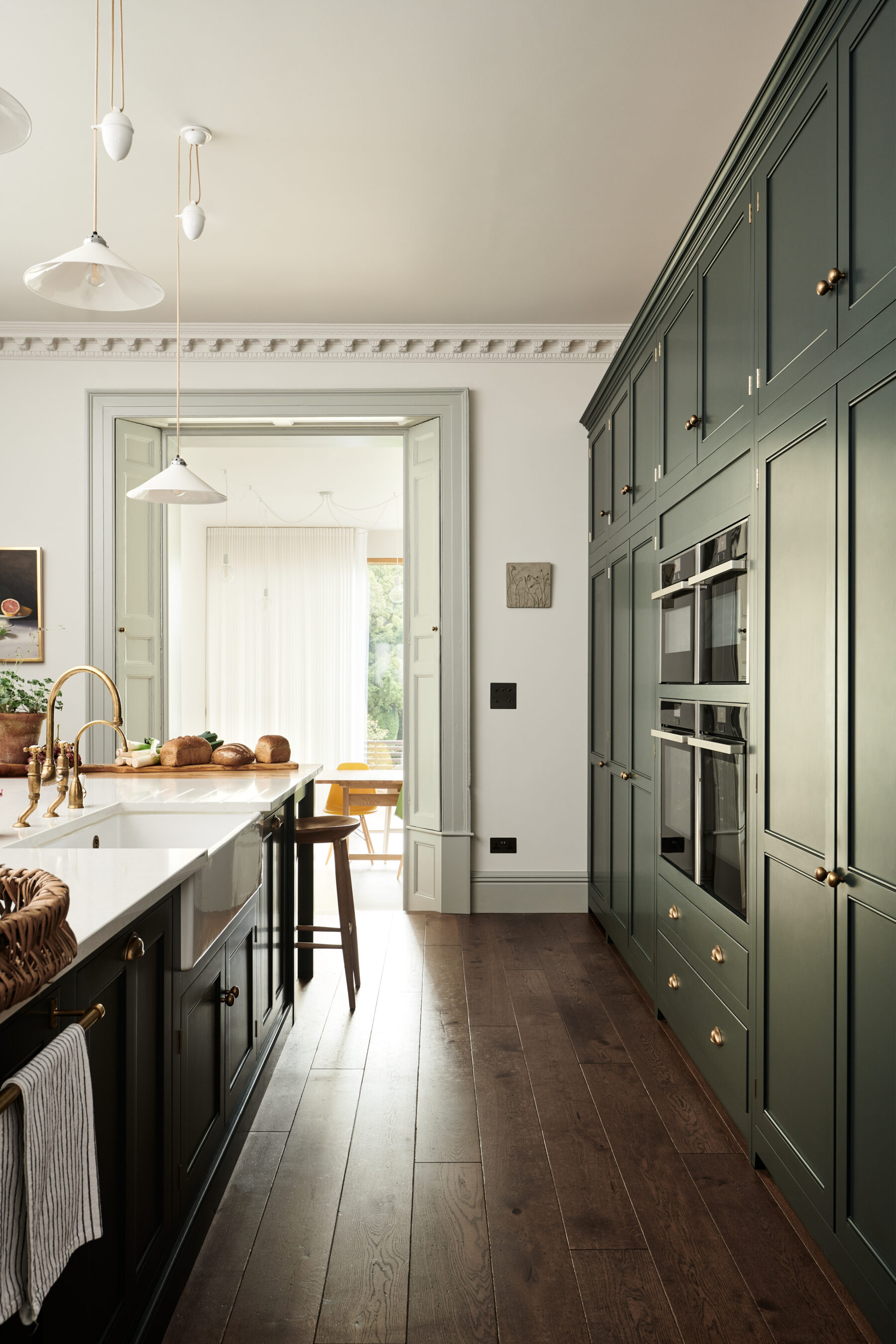
W I L K E S G R E E N
Seen for the very first time in our Green Room in Bath, this deVOL colour is old fashioned in the best kind of way. Opulent and deep, Wilkes Green has warm undertones and looks magnificent used to the max on walls, ceilings and cupboards too. We opted for brass fittings and a mix of light and dark worktops to show just how versatile this gorgeous green is…
(This shade is exclusive to our kitchen customers and not available to purchase separately)
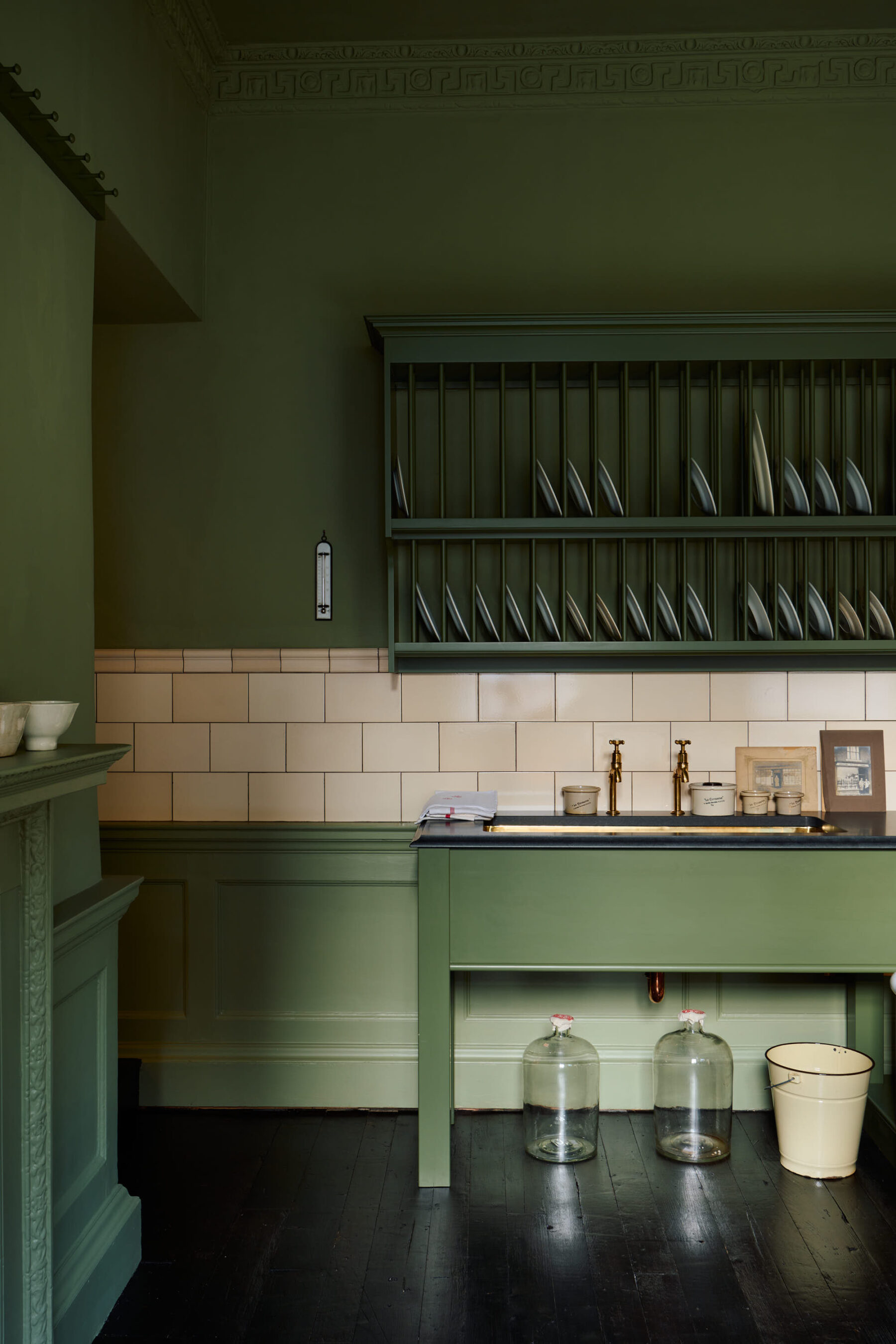
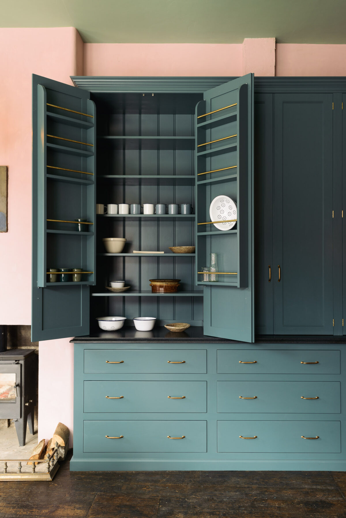
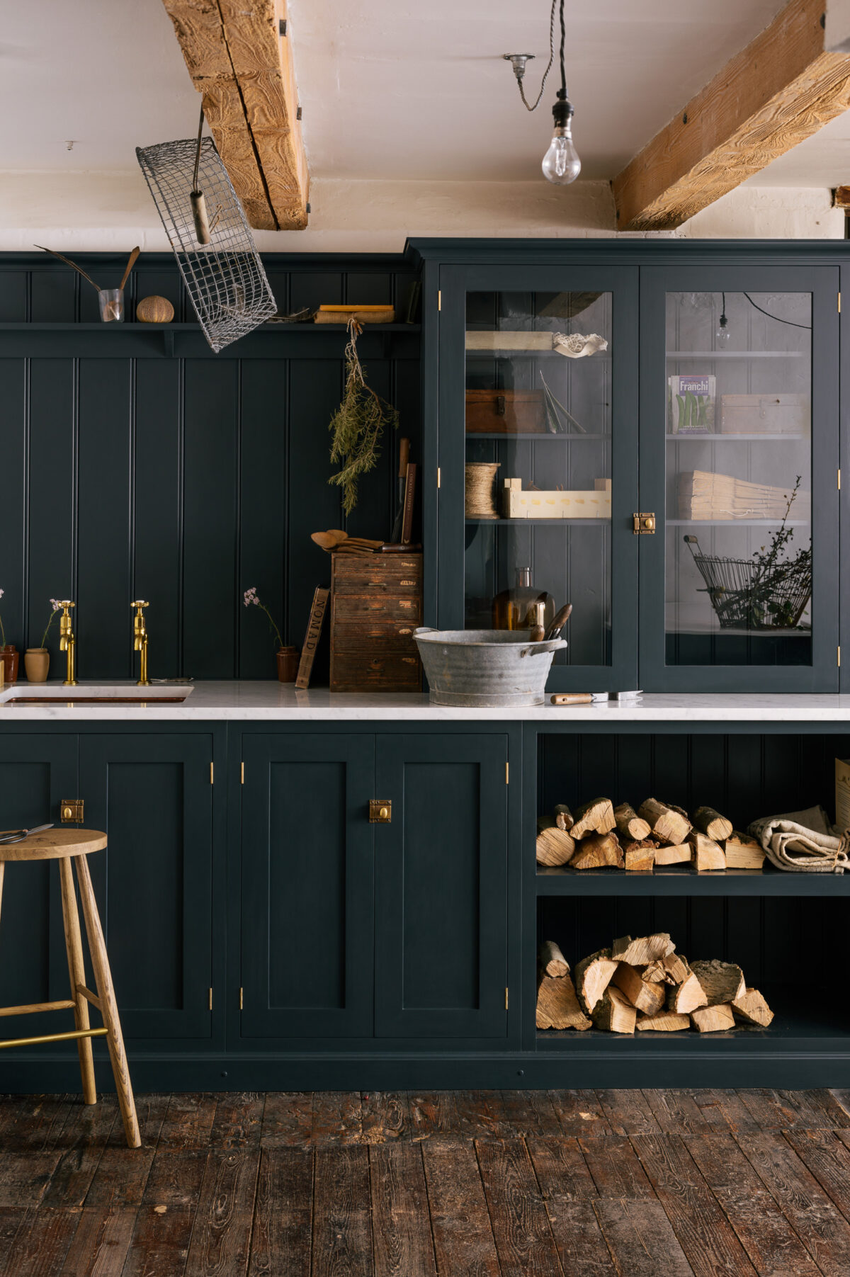
B A K E H O U S E G R E E N
Quite utilitarian and perfect for kitchens, this very dark green feels very old school and we love the way it instantly makes a piece of furniture feel very grown up and above fashion or trends. Pair it with a bold wall colour and our fabulous emerald green tiles like Joe from the Farm Workers Cottage in County Durham did and create a kitchen with total wow factor and charm, or mix with lots of aged brass and white walls for a really classic look like our Charnwood Forest project…
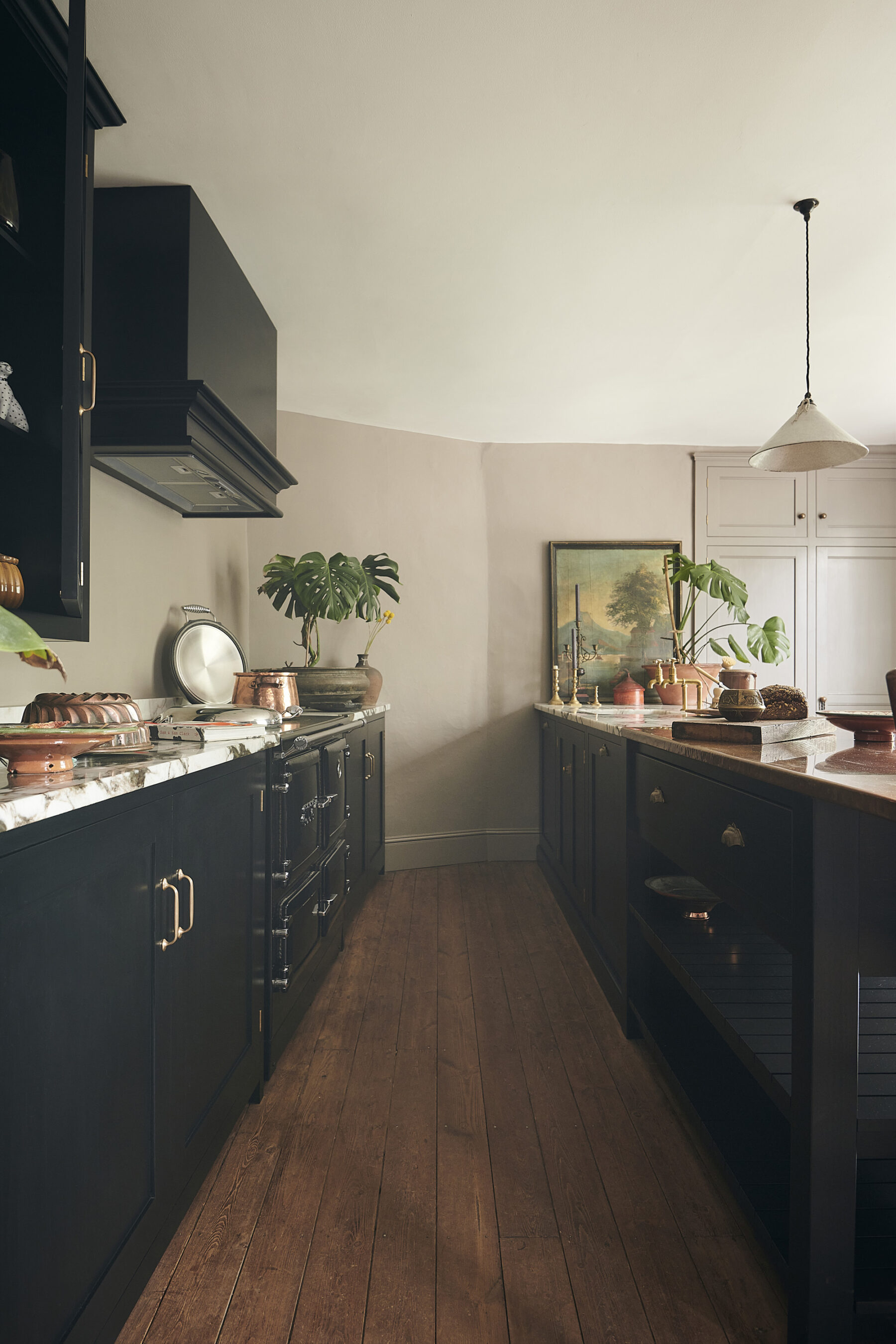
P R I N T E R ‘ S B L A C K
Bold, daring and elegant, but actually a very traditional choice for kitchen furniture. This colour is surprisingly gentle and soft and can give a very pared back and comfortable feel to a room. Our Creative Director, Helen, used this shade in her own kitchen and it’s become one of the most-loved deVOL projects ever with its totally un-kitcheny kind of feel. Add some aged copper worktops just like in our Shaker Millhouse Kitchen and you have instant understated glamour. Have a peek at the Chipping Norton Kitchen for more Printer’s Black goodness, and the Frome Kitchen to see this shade used in conjunction with two other colours.
T R I N I T Y B L U E
A soft traditional blue that makes no mistake you have got style, it oozes simplicity and elegance and could soften the look of anything it touched. It goes with everything and often gets a little gasp of joy when first seen. You might recognise this iconic wall of storage doused in Trinity Blue in the Strawberry Hill Kitchen, see it paired with Damask in this Edwardian Villa, oooh and take a look at this kitchen in St Albans, we named it after this perfect shade of blue as it was the first time we’d ever seen it in a customer’s kitchen and it just looked so good.
C L E R K E N W E L L B L U E
This colour reminds us of elegant townhouses in East London, although it works in all kinds of locations! It is not too dark and not too light and is a blue that will always stay classic yet edgy. Take a look at it in this old Regency terrace kitchen or pair it with bold combinations like pink or emerald green and you have yourself a very impressive look. The very best place to see this colour in all its glory is in the St. John’s Square showroom.
B O N D S T R E E T B L U E
A dark blue that feels very fresh, yet also traditional. This colour sings in the sunlight and can be quite moody in a dark room, so choose your worktops and accessories to suit the situation. We particularly love Bond Street Blue in long runs and on big cupboards, it was named after our Bond Street showroom in New York where we used it extensively, see lots more photos of this classic shade here.
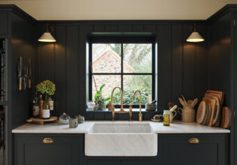
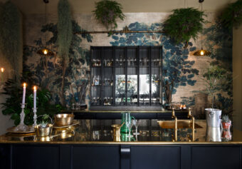
P A N T R Y B L U E
Dark, special and almost daring, Pantry Blue is so popular people often think it is a kitchen range called The Pantry Blue Kitchen, we love that it has become so synonymous with the deVOL look it almost has its own special meaning. It literally goes with anything and everything and is the easiest of the dark colours to go for as it’s uncomplicated to style up for glam or style down for effortless simplicity. We have soooo many amazing Pantry Blue kitchens but my favourite has to be the Victorian Rectory, the Petersham Kitchen is another great one as it uses this bold shade to the absolute max, cupboards, walls and ceilings!!, the Balham Kitchen pairs it with chunky concrete tops and the Cotes Mill Utility Room has become the most iconic little Pantry Blue room ever.
– The deVOL Shaker Paint Collection is now available to purchase in the UK separately from a kitchen, take a look at ‘Paint by deVOL‘.
– Our original furniture paint has an authentic satin sheen which is perfect for traditional furniture and interior joinery. Our emulsion paint has a beautiful flat matt finish and is designed for use on interior walls & ceilings.
– We really hope you enjoy our selection but remember, if you can’t find a colour you like we can mix you up a bespoke colour match for an additional cost.